Designing for the Next Stage of Healthcare
Posted September 2, 2014
The way in which practitioners and designers are approaching problem solving in healthcare is changing at a rapid rate. New innovations are challenging traditional assumptions about everything from how hospitals are designed to how patients are communicated to. Over the past week, Fast Company published two articles about projects that are changing procedures in the healthcare industry, or trying to.
The design firm, fuelfor, created The Hospitable Hospice handbook, that attempts to tackle problems in hospice care. The handbook is a step-by-step recommendation about how to change end-of-life palliative care for the better. The project won a 2014 International Design Excellence Award. Then there is Artocene, a new social enterprise from the mind of Iva Fattorini, that brings art into hospitals. The goal is to humanize, energize, and make hospitals more pleasant places to be so that patients and families of patients can heal in a positive environment.
On a more local level, ESI is working with City Health Works (CHW) to help the community healthcare organization redesign their tools to better serve their clients. CHW deals with Type 2 Diabetes patients in Harlem. Brought together by desigNYC, ESI and CHW are currently working together to make a small dent in the healthcare design deficit. Part one of our story was posted last week, and you can read it here.
This is the second in our series. Previously, we outlined how we were approaching the project and challenges posed. Today, we’ll explore what the actual designs will be. When we end our design and production phase, CHW will have the following tools to use on a daily basis.
As part of our evaluation phase for CHW, ESI considered all of CHW’s existing tools, both individually and as a whole. What we discovered was a wealth of useful information that was often obscured or complicated by inconsistent graphic treatment, duplication of information, and a lack of a clear hierarchy of information. For the Master Plan, we proposed improvements and enhancements for each of the existing tools, as well as design solutions to better clarify and integrate them as a total system.
Using this strategy, the main element that ESI will be designing for CHW is a more consistent graphic identity and language, which will apply to all materials and communications. This common graphic treatment is essential for clarifying information and integrating CHW’s many educational tools into a unified experience. It is also essential for better promoting the CHW brand — CHW does not currently have a unified brand that makes them recognizable in the community where they work, but new branding will help establish their presence as a trusted community partner.
Second, ESI will be applying this new graphic treatment to CHW’s entire collection of educational handouts that are used with clients. Currently, CHW provides dozens of handouts on a wide variety of topics, including medication, nutrition, physical activity, physical complications of diabetes, and more. But these handouts often include too much information, lack a clear hierarchy of information, and use a variety of visual styles, all of which can cause confusion.
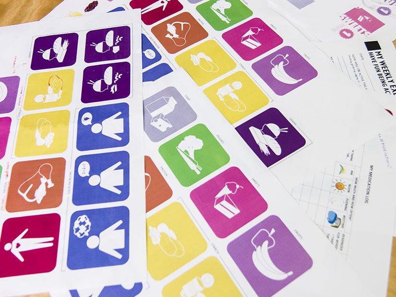
CHW requires an educational approach that is also more visual than text-based, both because many clients have language and/or literacy issues, and because clients in general find visual materials more engaging and effective. ESI recommended revising all handouts, so that they would have both the same graphic treatment and present a clearer hierarchy of information. But this would require a large amount of content (re)development by CHW. So as an interim step, ESI will create a new graphic treatment which includes a system of bold, colorful pictograms that quickly convey organizational categories (food, medication, etc.), and will create a set of templates that use this treatment as a “frame” that existing content can be easily popped into. Over time, CHW will be able to create new content that conforms to a more consistent, clearer, hierarchy of information as well.
Third, CHW has no system for keeping the handouts together or organizing them, which makes it difficult for clients to easily find the information they need later on. So ESI will also create a new binder system that presents all the handouts in a branded, organized, and efficient way. It will be designed both to work with the 12-session curriculum used by coaches, and to make it easier for clients to use the collection as a home reference.
Finally, ESI will also enhance the carb counting system that CHW uses to help clients track how many and what type of carbohydrates they eat each day. The current system, called Carb Bucks, gives each client five pieces of paper that look like dollars, one for each carb type. Each Carb Buck contains information about sample foods and portions sizes, and clients can use the bucks simply as reference tools or can “spend” them at a meal to help them track how many carb portions they eat. Because all information about a carb type is contained on a single buck, they are text-heavy, yet there is space to include only a few sample foods, which do not necessarily reflect the actual diets of the clients who use them. ESI’s goal with redesigning Carb Bucks, as with the binder of educational handouts, is to take a tool that CHW already uses and make it more effective. The redesign of this particular tool will include making a greater variety of bucks that are more visual than text-based, that allow a great variety of foods to be represented, and that can even potentially be used like playing cards for a more engaging, game-like experience.
Our design for CHW will create more consistent and compelling branding and educational tools, which will help them attract and aid more clients. Better design does lead to better healthcare. Healthcare is not a unique type of consumable that can be consumed without design intervention. As more and more healthcare products and processes are designed, the industry as a whole will become more efficient and easier to understand. This will lead to better care for us all into the future.
Join The Conversation